 11
11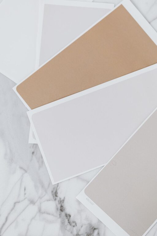
Creating a calm and relaxing environment in your home starts with the colors you choose for your walls, furniture, and accessories. Calm colors can influence your mood and help you feel more at ease after a busy day. If you’re looking to refresh your living space or start from scratch, this guide will walk you through helpful tips for choosing calm colors that suit your style and bring tranquility to your home.
Before diving into color options, it’s important to understand why calm colors matter. Colors affect emotions—cool tones can soothe, warm tones can energize, and neutral shades provide balance. Calm colors tend to be softer, muted, or pastel shades that promote relaxation and comfort.
Some benefits of choosing calm colors include:
– Reduced stress and anxiety
– Enhanced focus and clarity
– A welcoming, restful atmosphere
– Timeless appeal that easily adapts to changes in decor
Different areas of your home serve different functions, and the colors you select should support those purposes. Here are some general guidelines:
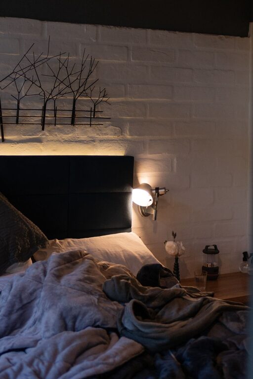
– Bedrooms: Soft blues, gentle greens, or warm neutrals create restful spaces for sleeping.
– Living rooms: Warm grays, muted taupes, or pale lavenders encourage conversation and relaxation.
– Bathrooms: Light aqua or seafoam green evoke cleanliness and calmness.
– Home office: Light shades of blue or green can boost focus without overwhelming.
– Kitchens: Soft yellow or creamy whites create a cheerful yet peaceful vibe.
Thinking about how you use each room will help you pick colors that enhance the mood you want.
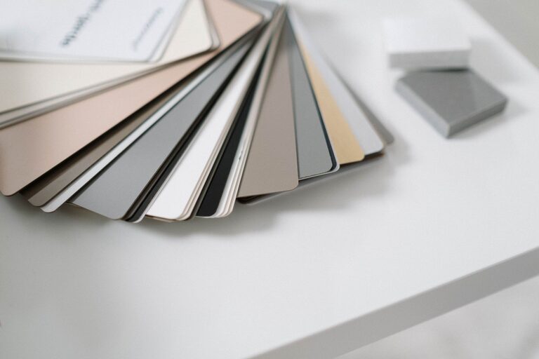
Not all colors have the same effect. Choosing the right shade is key to maintaining calmness.
– Soft pastels: Light versions of colors like blue, green, pink, and lavender often bring a soothing feel.
– Muted tones: Colors with gray undertones are less intense and more calming.
– Neutral palettes: Shades like beige, cream, soft gray, and greige (gray-beige) are versatile calming choices.
– Earth tones: Soft browns, gentle olives, and warm terracottas connect you to nature for a grounded feeling.
Avoid overly bright or saturated colors in spaces meant for relaxation as they can be too stimulating.
Colors can look very different depending on the lighting. It’s important to test your selections:
– Natural light: Observe how colors appear during the day. South-facing rooms get warm light; north-facing rooms have cooler light.
– Artificial light: Check colors under your indoor lighting—LEDs, incandescent bulbs, or fluorescent lamps can alter hues.
– Try painting test patches on several walls or large poster boards to see how the color changes throughout the day.
This step helps ensure your calm colors feel right in your specific environment.
Calm colors don’t mean one color for every wall. You can create interest and balance with thoughtful combinations.
– Monochromatic schemes: Use various shades, tints, or tones of a single calm color to add depth.
– Analogous colors: Choose colors next to each other on the color wheel (like blue and green) for harmonious blends.
– Neutrals with soft accents: Pair neutral walls with calm pastel accessories like cushions or curtains.
Keep contrast subtle to avoid breaking the tranquil vibe.
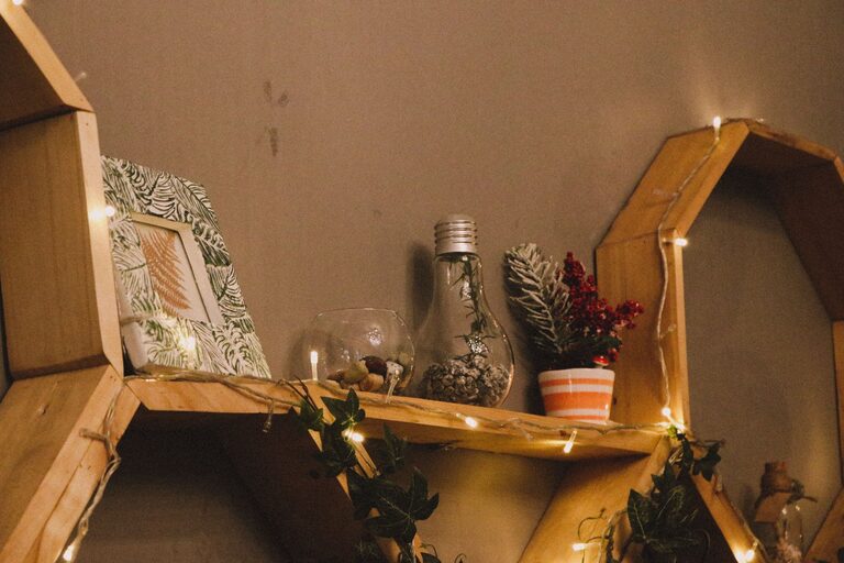
Color is only one part of creating calm. Texture and natural materials complement calm colors beautifully:
– Soft fabrics such as linen, cotton, or wool add coziness.
– Wooden furniture or decor adds warmth and an organic touch.
– Natural plants bring life and contribute to a soothing environment.
Combining these elements with your chosen calm colors enriches the overall room atmosphere.
Once you’ve selected your calm colors, here are some tips to keep your home feeling peaceful:
– Keep clutter to a minimum. Calm colors shine in tidy, organized spaces.
– Rotate accessories seasonally to refresh without overwhelming.
– Use consistent colors in adjoining rooms for flow.
– Allow natural light to enhance your color scheme whenever possible.
Here are some popular calm colors and why they work well at home:
– Soft Blue: Invokes the sky and sea, offering relaxation.
– Sage Green: Earthy and fresh, it promotes balance.
– Warm Gray: Neutral and cozy, it grounds spaces without dullness.
– Blush Pink: Gentle and warm, adds a subtle touch of softness.
– Light Lavender: Calm and slightly uplifting, perfect for bedrooms.
Feel free to explore these or find your personal favorites that help you unwind.
—
Choosing calm colors for your home is an enjoyable and rewarding process that dramatically affects how you feel in your space. By considering the room’s purpose, lighting, and complementary elements, you can create a soothing environment that supports relaxation and happiness every day. Take your time experimenting, and soon your home will reflect the calm and comfort you desire.